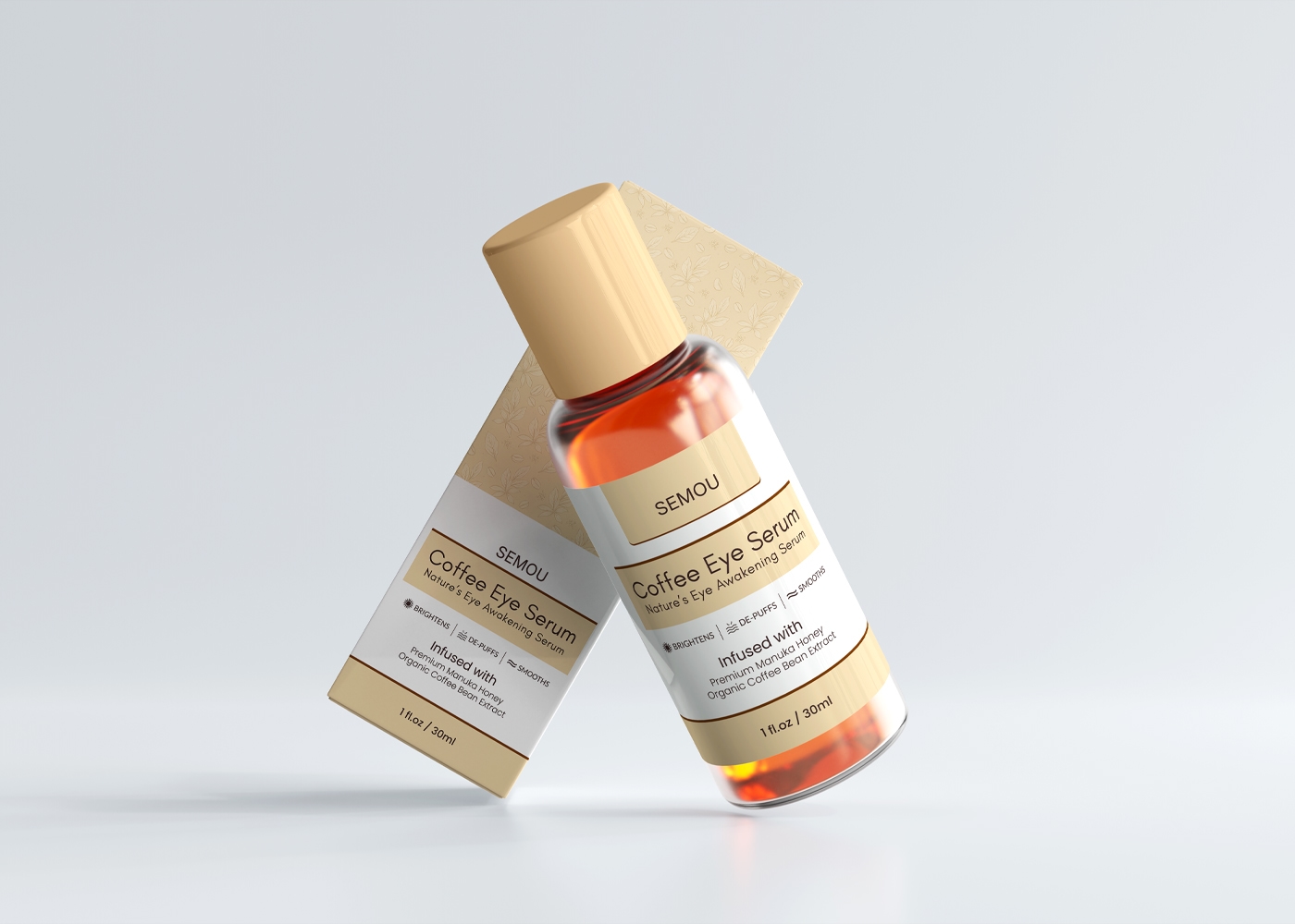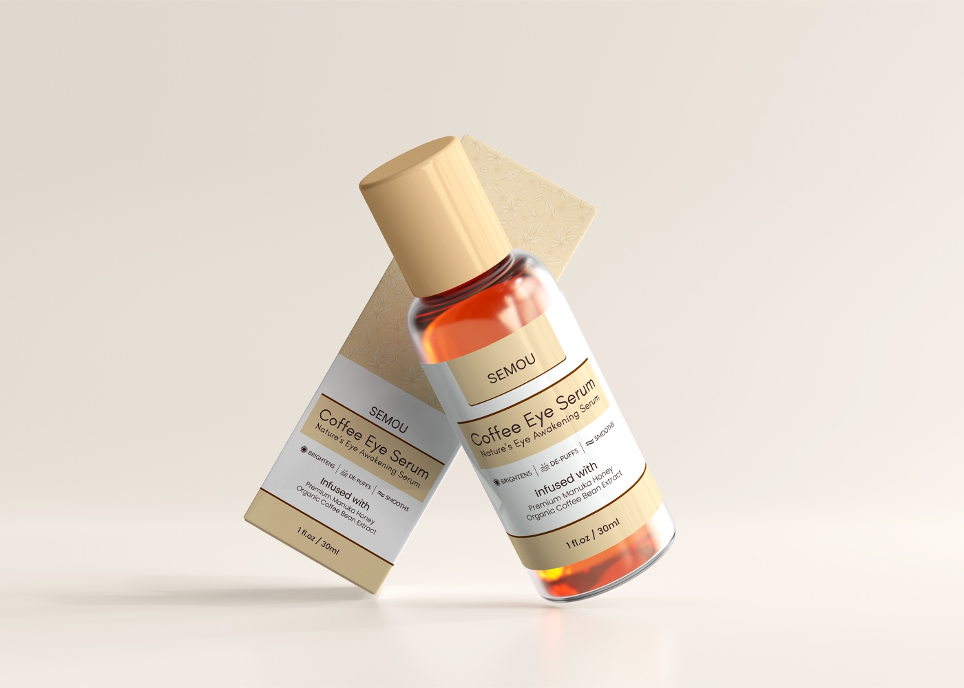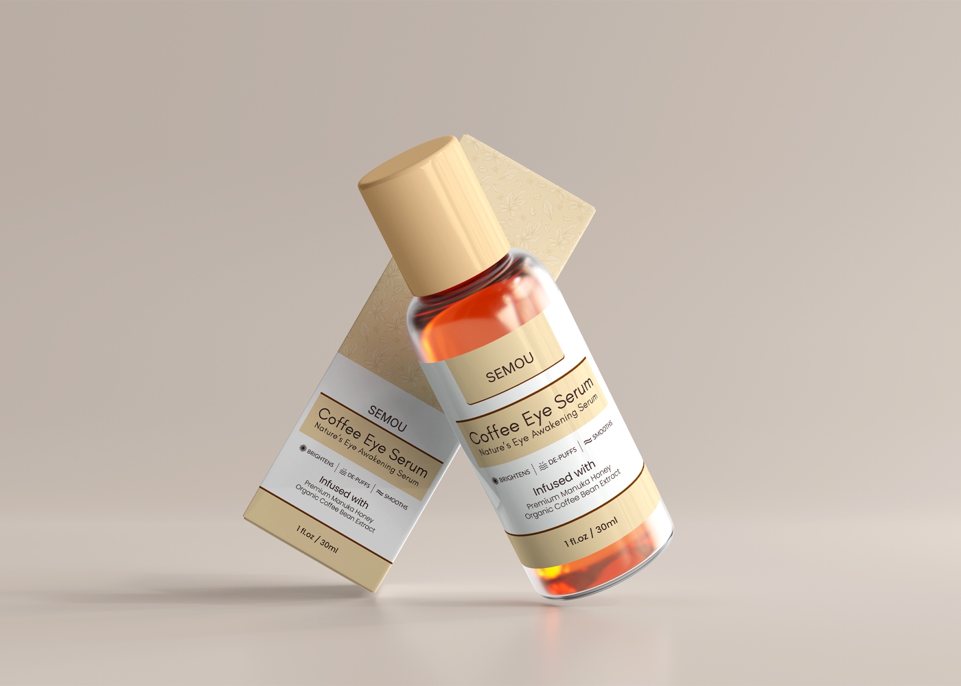


Minimalist Coffee Eye Serum Packaging Design
This Minimalist Coffee Eye Serum Packaging design for SEMOU reflects the brand’s Natural, Revitalizing, and Premium essence — showcasing purity, nourishment, and trust, while emphasizing its commitment to safe, organic, and effective skincare.
1. Design Objectives
The aim of this packaging is to create a premium, natural, and trustworthy look that communicates the refreshing and nourishing benefits of the Coffee Eye Serum.
2. Brand Tone + Design Tone Alignment
The brand tone is Refreshing, Natural & Caring. To match this, the design uses a clean, minimalist structure with warm and organic-inspired visuals, aligning perfectly with a modern premium skincare product.
3. Color Scheme
White: Used as a background and highlight color to represent purity, freshness, and simplicity.
Dark Brown: Chosen to symbolize richness, coffee essence, and natural depth. It is applied to key texts and accents, reinforcing the coffee-based formulation.
Soft Beige / Golden Nude: Applied as an accent color to add luxury, softness, and elegance, highlighting product claims and decorative sections.
4. Feature Highlights + Graphic Structure
Prominent product name “Coffee Eye Serum” with tagline “Moisturizes & Awakens Eyes”.
Clean layout highlighting benefits: “Infused with Caffeine & Avocado Oil”.
Balanced structure with natural tones ensures a premium shelf appeal.
5. Additional Benefits
Minimalist design communicates natural purity and organic quality.
Earthy beige and brown tones connect directly with coffee ingredients.
Professional tone with high readability builds trust with consumers.
6. Typography & Information Hierarchy
Serif font for the product name creates an elegant, luxurious feel.
Sans-serif font for details ensures clarity and modern appeal.
Information hierarchy: Brand Name → Product Name → Benefits → Ingredient Details.
7. Visual Design Benefits
The chosen palette of white, dark brown, and soft beige creates a harmonious, natural, and premium look.
Clean contrasts ensure maximum readability and strong branding.
Overall design reinforces SEMOU’s positioning as a safe, effective, and luxurious skincare brand.
