
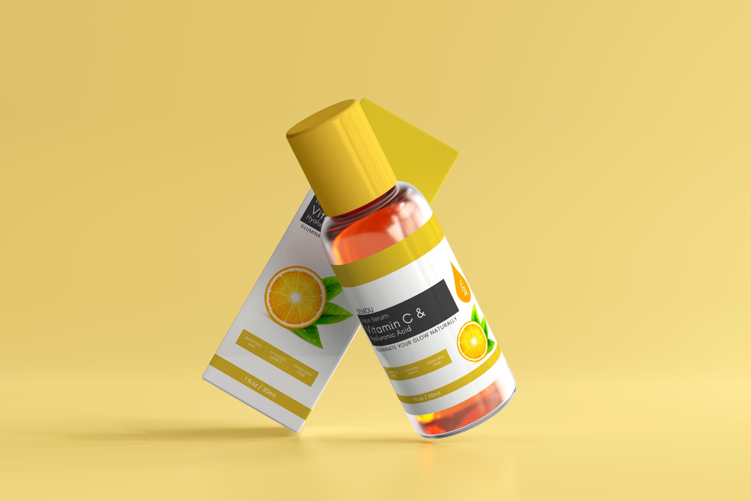
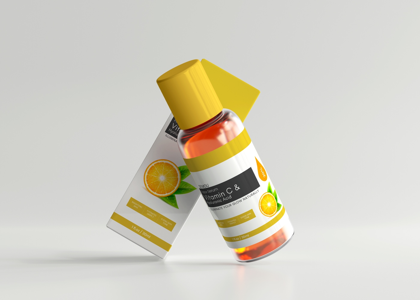
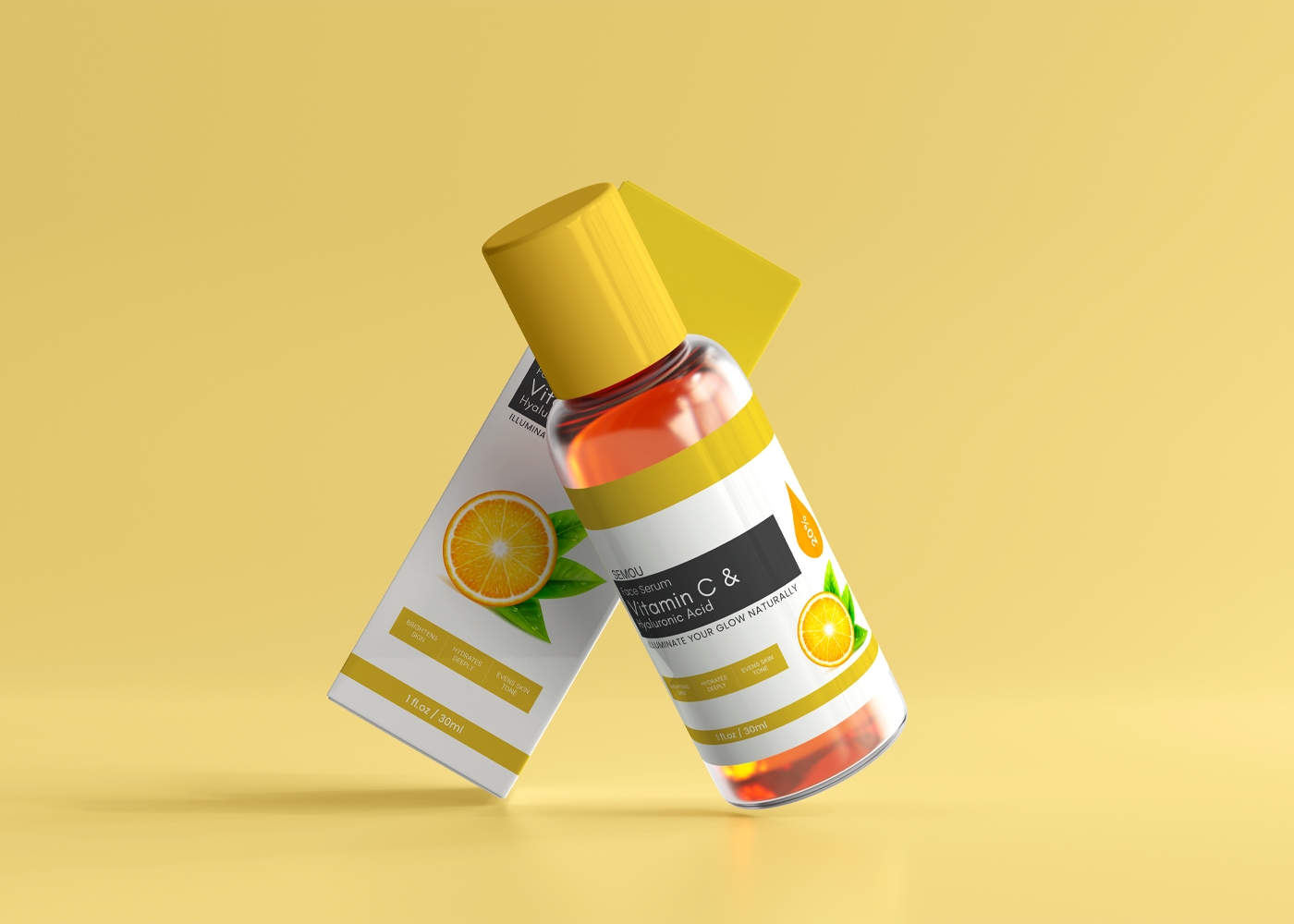
Minimalist Vitamin C Serum Label Design That Boosts Your Brand
This Vitamin C serum label design was created for health-conscious individuals who value skincare and prioritize natural beauty. The design captures a fresh, trustworthy, and caring tone aligned with the brand’s identity.
Target Audience
Men and women aged 22 to 45
Conscious about skincare and skin health
Prefer natural, effective, and minimal products
Urban and busy lifestyle individuals seeking radiant, healthy skin
Color Theme & Meaning
Colors used:
Charcoal Gray
Creamy Nude
Rich Gold
Color Roles:
Charcoal Gray is used for key texts to reflect professionalism and clarity
Creamy Nude provides a soft, clean background that enhances a natural, calming look
Rich Gold highlights product value and glow, suggesting luxury and vitality
Typography & Shape Style
Typography: A clean, sans-serif font has been used for modernity, easy readability, and minimal aesthetics
Shape Style: The design features sharp rectangular shapes (not rounded), which support a structured, premium, and confident visual appearance that aligns with the brand’s tone
Visual Elements: Orange Line Art & Serum Drop Icon
Orange Slice Line Art clearly represents the key ingredient — Vitamin C — visually connecting freshness and antioxidant power
Drop Icon symbolizes hydration and deep moisture, reflecting the serum’s functional benefit for dry or dull skin.
This design is not just a label – it is a reflection of fresh, natural, and trustworthy beauty, perfectly embodying the brand’s caring vision and the genuine benefits of skincare.