
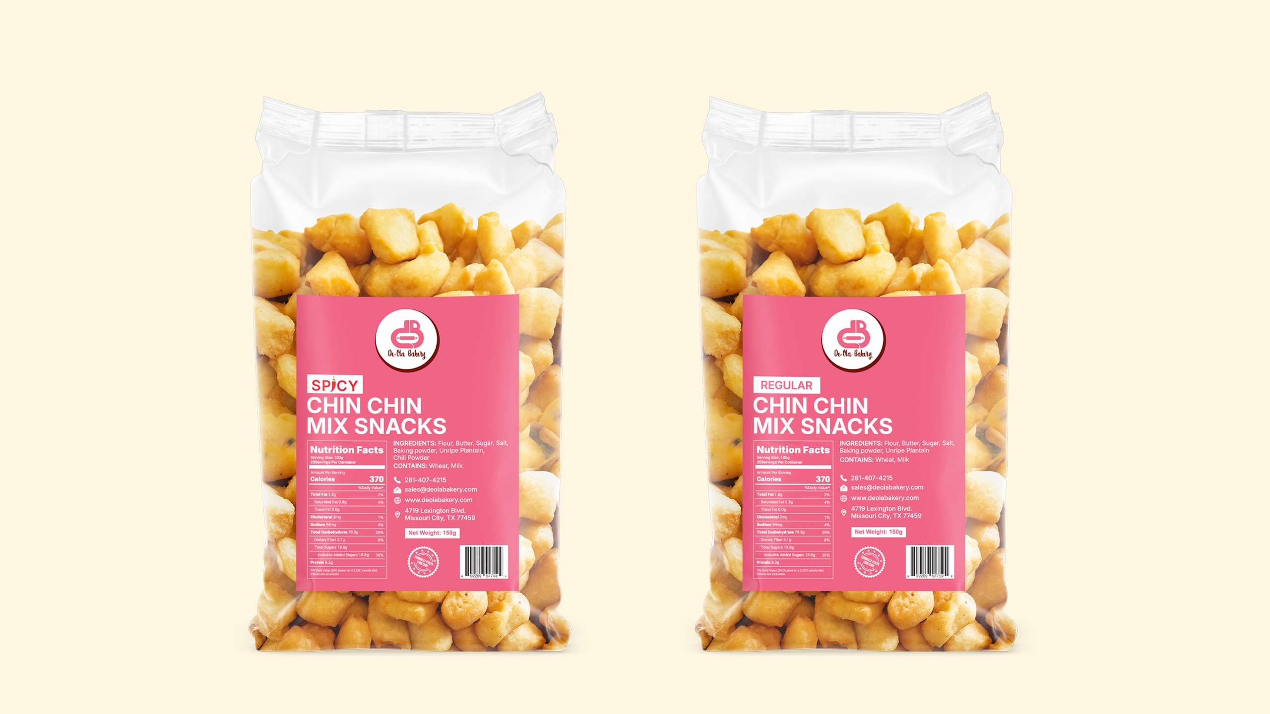

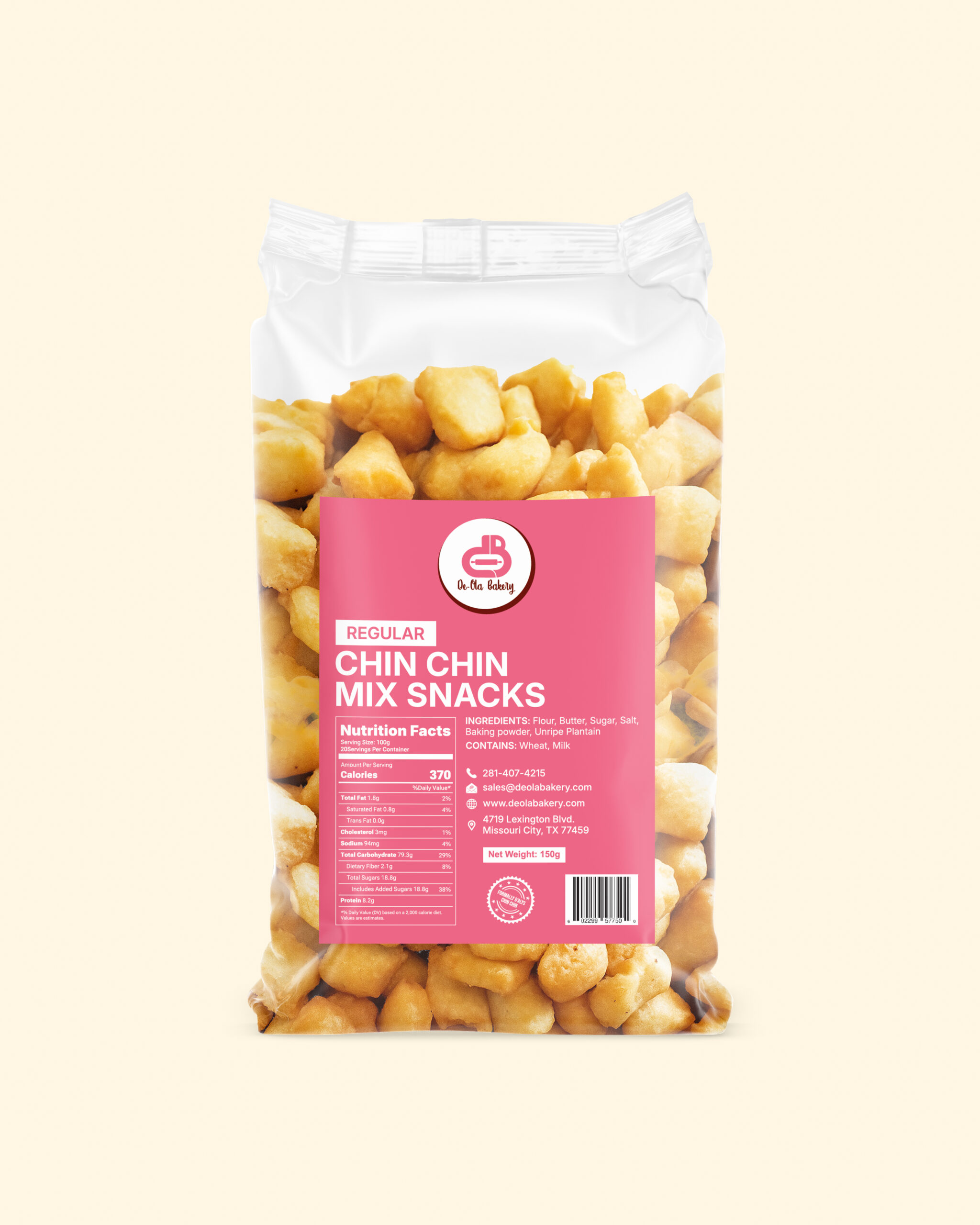
Premium Chin Chin Mix Packaging – Spicy & Regular
Design Objectives
The main goal of this packaging design was to create a clean, attractive, and modern look that reflects the authentic taste of the product while appealing to both adults and teenagers in the African market.
The design focuses on product visibility, variant differentiation (Spicy & Regular), and strengthening brand identity.
To achieve this, I followed the brand guidelines carefully to deliver a clean and balanced result.
Brand Tone + Design Tone Alignment
Brand Tone: Friendly, authentic, and trustworthy – highlighting the warmth of African snack culture.
Design Tone: Minimal, bold, and eye-catching, while remaining culturally relevant. The design conveys freshness, quality, and authenticity, making it perfectly suited for retail stores.
Color Scheme
The color palette is derived directly from the brand colors:
Bright Pink: Used as the primary background to create energy and appetite appeal.
Deep Brown/Maroon: Used as a secondary color to balance the bright tone and provide an earthy, cultural connection to African snacks.
Variant Differentiation
Spicy Variant: Highlighted with a bold red “SPICY” label.
Regular Variant: Marked with a subtle maroon “REGULAR” label.
Feature Highlights + Graphic Structure
Central Label Block: All key information is placed on a bright background in a clear hierarchy.
Variant Tag: Color-coded labels (SPICY/REGULAR) ensure easy recognition.
Nutrition Facts & Ingredients: Displayed clearly on the front.
Contact & Brand Info: Website, email, and barcode are positioned at the bottom to reinforce credibility.
Additional Benefits
Easy to Spot in African Stores: Bright colors and bold labels stand out among competitors.
Consistent Variants: Both flavors follow the same design structure, differentiated only by tag colors.
Consumer Trust: Transparent details on ingredients and nutrition build customer confidence.
Typography & Information Hierarchy
Primary Typography: Bold sans-serif (CHIN CHIN MIX SNACKS) – large and easy to read from a distance.
Secondary Typography: Smaller sans-serif font for ingredients, nutrition facts, and contact details.
Hierarchy:
Variant Tag (SPICY/REGULAR)
Product Name (large & bold)
Nutrition & Ingredients
Brand Logo (top of label)
Contact Info & Barcode (bottom)
Visual Design Benefits
Shelf Impact: Bright colors and bold typography ensure strong visibility in retail environments.
Consumer Appeal: Transparent pouch allows the real product to be visible, enhancing appetite appeal.
Cultural Connection: Earthy tones combined with pink create a modern yet relatable design for African markets.
Professionalism & Trust: A retail-ready design with barcode and contact info boosts brand credibility.