
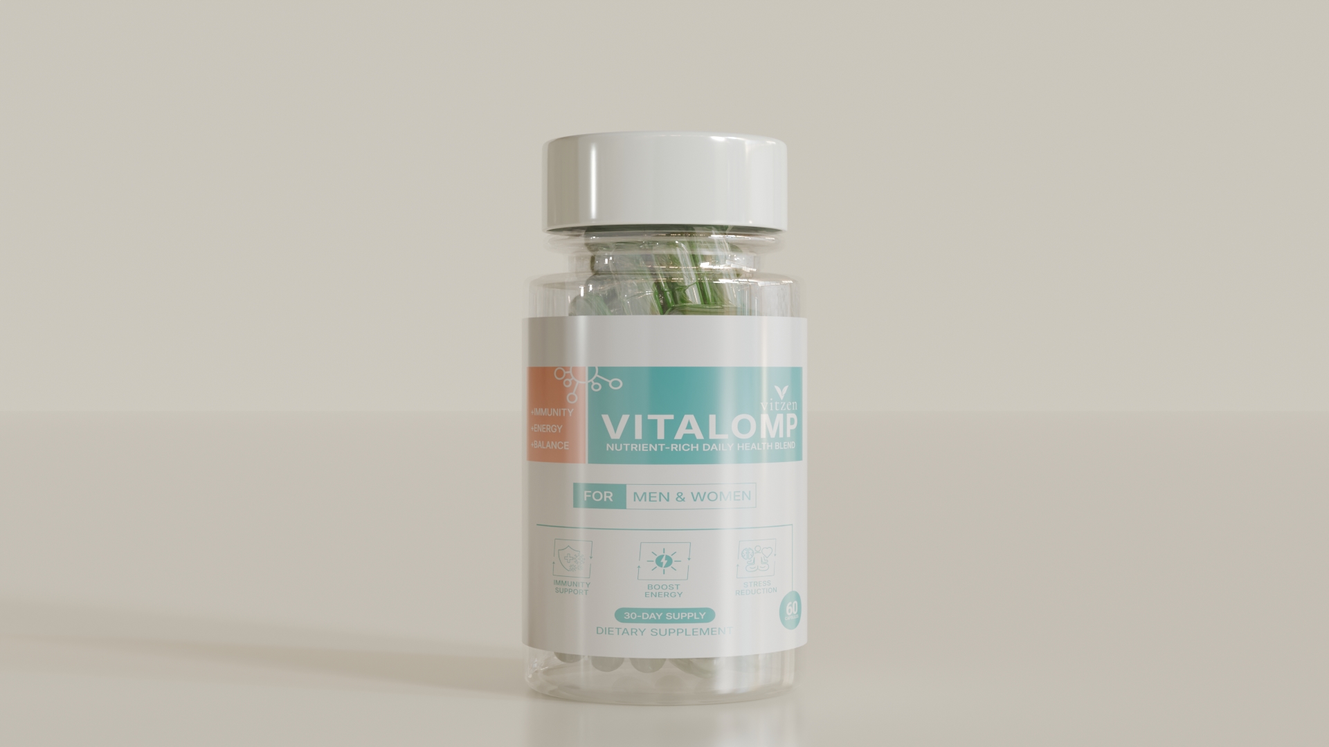
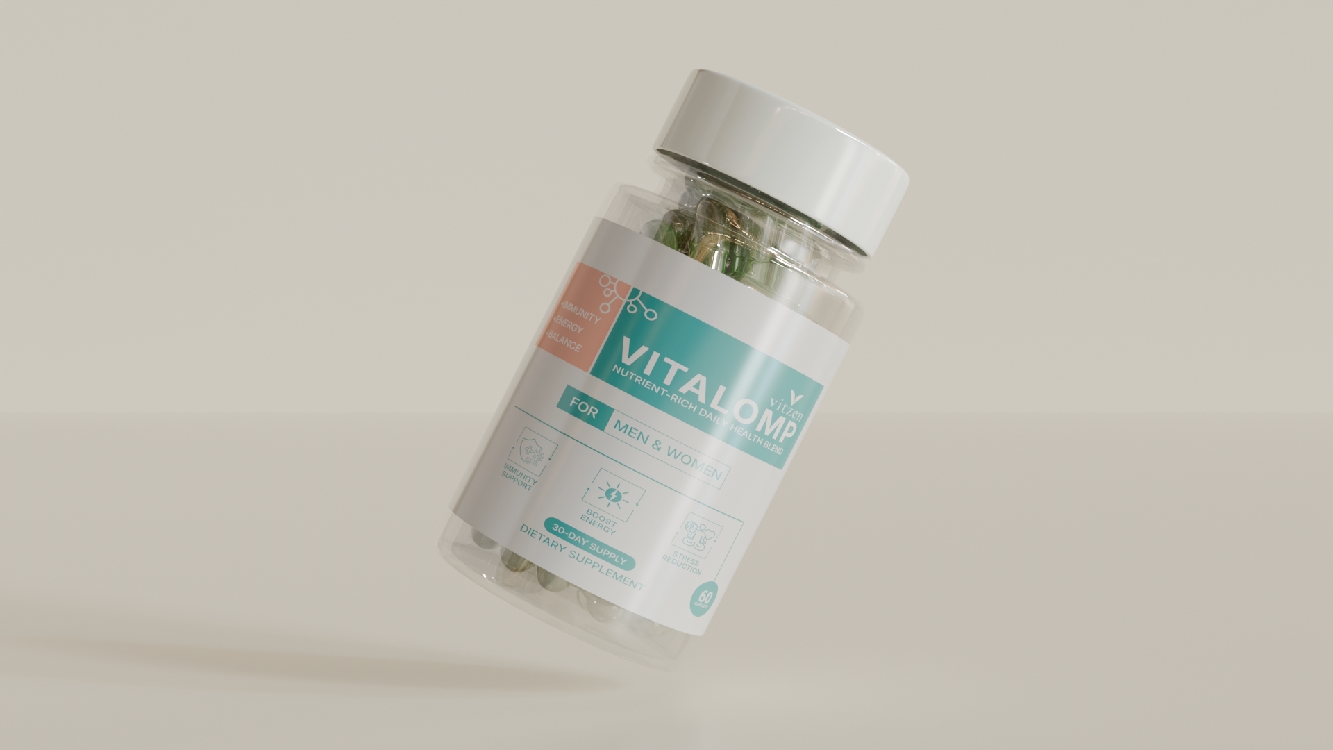
VITALOMP Supplement Label Design
This supplement label for VITALOMP is designed specifically for working men and women aged between 25–45 years – those who want to stay energetic, balanced, and overcome daily fatigue caused by a hectic and stressful lifestyle.
Design Objectives:
The label is carefully crafted to:
Make essential information easily noticeable
Clearly communicate the product’s benefits and brand vision
Encourage customer trust and interest to pick up the product
Brand Tone + Design Tone Alignment:
VITALOMP’s brand tone is: Trusted + Caring + Supportive.
This tone has been visually translated through the layout, color palette, typography, and icons.
Trusted: A clean and balanced design style builds consumer confidence
Caring: Soft, health-inspired colors and minimal icons reflect a considerate, well-being-focused brand attitude.
Supportive: Highlighted features, structured hierarchy, and clear information presentation help customers make quick, confident decisions
Color Scheme:
Three key colors were used:
Light Grey: A clean and neutral background that makes all elements stand out.
Teal Green: Represents health, balance, and refreshment; conveys safety and reliability.
Soft Coral Orange: A warm, attention-grabbing color used to highlight key parts of the label.
Feature Highlights + Molecular Shape Structure:
Next to the product name, the three core benefits are listed:
+ Immunity
+ Energy
+ Balance
Above these benefits, a molecular node structure visual element is used – consisting of small interconnected circles and lines.
This abstract scientific shape:
Visually unifies the benefits
Suggests a science-backed, well-balanced formula
Reinforces the brand’s research-based, trusted identity
Typography & Information Hierarchy:
Typography creates a clear reading flow across the label:
“VITALOMP” is large, bold, and centered – making the brand feel strong and premium
“Nutrient-Rich Daily Health Blend” is placed right below in smaller but clear size – delivering a quick understanding of the product.
“FOR MEN & WOMEN” is featured in a highlighted box – instantly revealing the target audience.
This hierarchy ensures that the customer naturally absorbs the most important information first.
Icon System & Semi-Circular Border Arrows:
At the bottom of the label, three minimal icons are placed:
Shield: For immune support
Lightning Bolt: For energy
Yin-Yang Symbol: For stress relief and balance
Below each icon is a semi-circular curved arrow pointer resembling a rounded border fragment. These serve two purposes:
Visual Focus:
The semi-rounded shapes beneath the icons draw the viewer’s attention, emphasizing their importance even within a minimal design.
Directional Guidance / Motion Feel:
Each shape ends in a downward-pointing arrowhead, visually implying that these functions actively work within the body, similar to a scientific mechanism
Visually effective communication for health-conscious young professionals.
Print-ready label – ready for direct use in production.
Visually appealing both for online marketplaces and physical stores.
Reinforces brand values of Trust, Care, and Supportiveness.