Jahidul Islam

BeePure Organic Honey Jar Label Design

Project Overview

Client

Commercial

Industry

Food & Beverage

Services

Packaging & Label Design

Year

2025

The Challenge

  • Balancing Natural and Premium Visuals

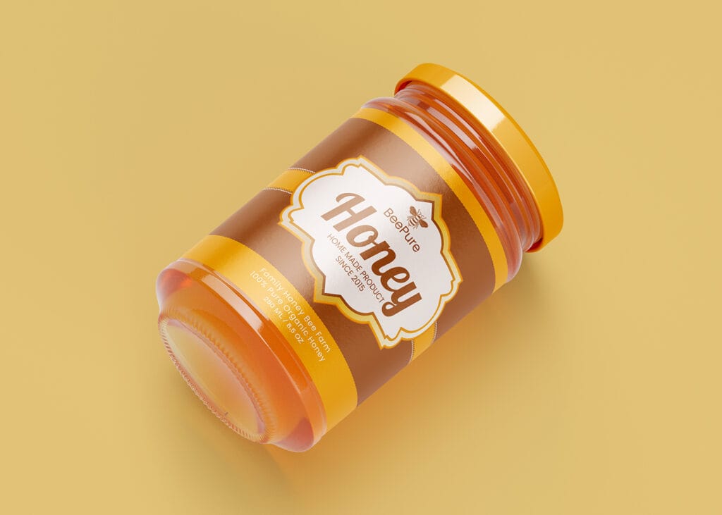
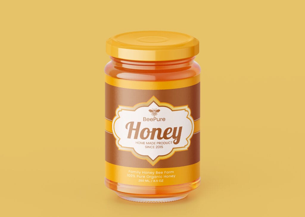
    The challenge is creating a design that feels organic and authentic while maintaining a high-end, premium appearance suitable for modern retail packaging.

  • Achieving Strong Label Readability

    The central badge contains the most important branding elements, so typography, spacing, and contrast must remain clear and readable against the warm color palette.

  • Creating Color Harmony

    The honey-colored product, golden cap, and brown-gold label elements must work together seamlessly to create a unified and visually appealing packaging design without overwhelming the viewer.

This Organic Honey Jar Label Design showcases a premium and professional packaging concept created specifically for natural honey products. The design combines warm honey-inspired colors, elegant typography, and a clean label structure to create a visually appealing and trustworthy product presentation. The Organic Honey Jar Label Design features a sophisticated combination of golden yellow and rich brown tones that reflect the natural characteristics of pure honey. The central badge-style label creates a strong focal point, helping the product stand out while maintaining a refined and premium appearance. This thoughtful approach makes the Organic Honey Jar Label Design ideal for organic honey brands, homemade honey products, and premium food packaging projects. A successful Organic Honey Jar Label Design should communicate purity, authenticity, and quality at first glance. This design achieves that goal through balanced color harmony, clear typography, and an attractive packaging layout. The label structure provides excellent readability while preserving an elegant visual identity that supports effective brand recognition. This Organic Honey Jar Label Design is also a great example of modern Organic Honey Packaging Design. The warm color palette complements the honey product inside the jar, creating a cohesive and professional look. Businesses searching for inspiration for Honey Jar Label Design, Premium Honey Label Design, or Natural Honey Product Label concepts can use this design as a reference for creating attractive and marketable packaging. The visual hierarchy has been carefully organized to ensure that the brand name remains the primary focus while supporting information stays clear and accessible. As a result, the Organic Honey Jar Label Design delivers both aesthetic appeal and practical functionality. The combination of premium styling and natural visual elements helps position the product as a high-quality honey offering in a competitive market. Whether used for branding inspiration, portfolio presentation, client showcases, or commercial packaging projects, this Organic Honey Jar Label Design demonstrates how effective packaging can enhance product value and strengthen brand perception. With its elegant design language, harmonious color scheme, and professional execution, this Organic Honey Jar Label Design represents an excellent solution for premium honey packaging and modern product branding.

Strategic design that defines premium packaging

Let’s craft packaging that stands out, sells more, and strengthens your brand.

Scroll to Top